Dining Room Chairs
We’ve been on the hunt for the perfect dining room chairs for our current project at Pheasant Pointe. Our clients really love the classic CH24 Wishbone chair, but for a family with small kids around, the woven seat is not a great option. After a lot of deliberation we chose Anthropologie’s Leather Hagen Dining Chair. It embodies the low-slung sleek lines of Danish Modernism but the leather makes it ultra comfy and, more importantly, cleanable! I think they’re the perfect choice! It’s also available in velvet and cozy boucle.
While we were looking for our Goldilocks “just right” chair, we found SO many other great options - check them out! (Make sure to scroll to the bottom for a bonus chair!)
The original CH24 Wishbone Chair designed by Hans J. Wegner for Carl Hansen & Søn in 1949. Available in a wide range of colors and material, staring at $947
Drumawillen Side Chair - this is a fantastic budget-friendly option - a set of two chairs is under $200! This is actually a knockoff of another Carl Hansen chair - CH20, The Elbow Chair.
Rylie Dining Chair from Anthropologie - $298.00 - Doesn’t this chair look so comfy? I love the leather (available in 4 colors) with the contrasting top stitching.
Savis Chair by Article - $299 - I just love this chair - it was a close runner up to the chair we ended up selecting!
Ripple Chair by Industry West - $199 - Not only is the shape of this chair so cool, I love the visual lightness of it as well. It’s available in four great colors, too!
Keva Upholstered Dining Chair by Pottery Barn - $279 - First - this color! So gorgeous - this chair would be great in both formal and informal dining areas. Really pretty.
Baldwin Dining Armchair by Williams-Sonoma - $395 - This is a great update to the original Wishbone Chair - it maintains the line of the chair but feels a little more grounded.
Taika Leather Dining Chair by Safavieh - $292 for a set of 2 - How cool is this chair? Really great shape combined with leather webbing? Love it. Would also be great as a foyer chair!
Wexler Dining Chair by Target - You guys, these chairs are a STEAL! $161 for a set of 2. This update to the Wishbone Chair might be my favorite yet - the solid seat, the fun colors? Love them!
BONUS CHAIR! It didn’t make the composite, but this chair - it’s a beauty! Kai Arm Chair from All Modern - $411 - This chair is so simple, no energy is wasted on anything unnecessary, and yet it still has so much style.
Pleasant Hill's Interior
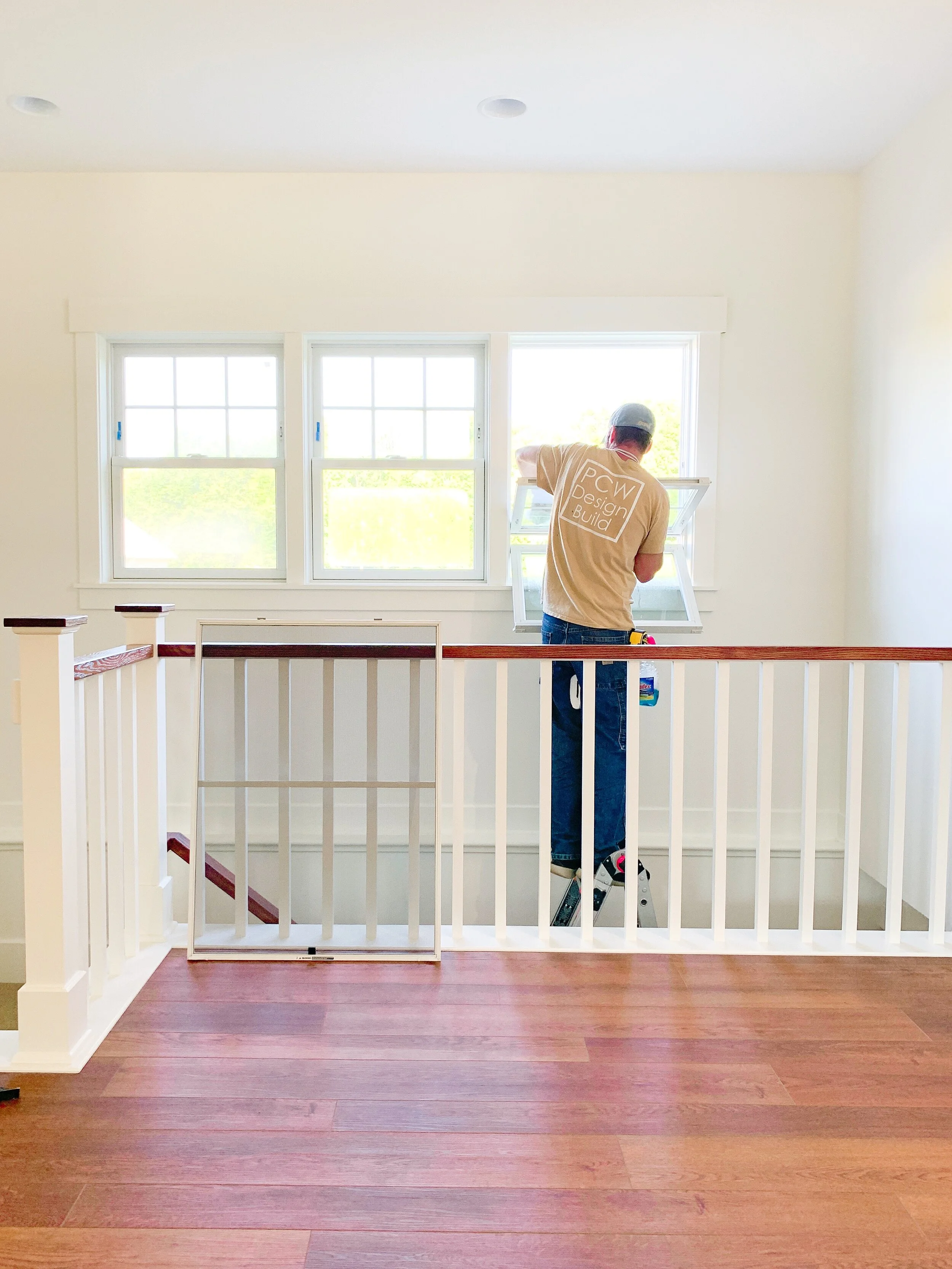
I love this photo - mainly because it’s not me having to wash those windows (Whose idea was it to put in so many windows again!? Oh, yeah… that would be me.) but also because it’s a good reflection of the kind of company we are. Hands on, start to finish. Our team always cleans our projects ourselves because it’s a great time to give the whole job a good once-over. And now, the post everyone’s been waiting for…
For orientation purposes I made this handy little layout!
I took all these photos on the last day… so you’ll notice some light fixtures are missing! But I managed to get some good shots despite the 20 people on site!
Let’s jump inside! This house is really different from a lot of homes we’ve designed. The clients wanted the option of having the house feel wide open - for when it’s just the two of them, or more compartmentalized - for when they have house guests. So the Owner’s Suite is comprised of the bedroom, closet, bathroom and laundry room which are all connected with pocket doors. (In fact, there’s a pocket door on the right in that hallway up there that allows afternoon light to flood into the Owner’s Suite.) The kitchen has wide double doors so it feels connected to the rest of the house when they’re open, but it can also be completely closed off.
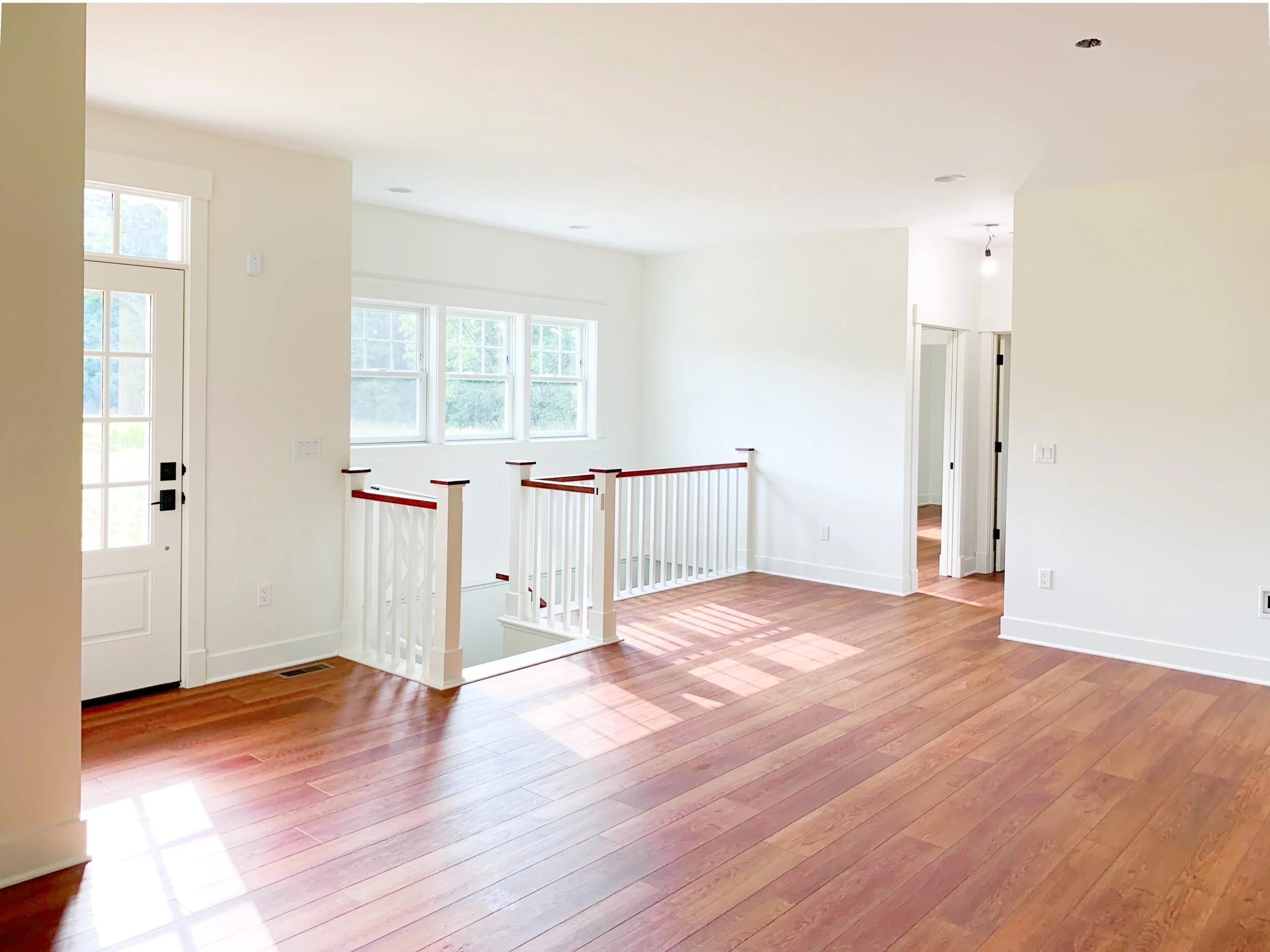
In the photo above, taken from the Dining Room, we look toward the front of the house. We framed the informal entry with the simple square-spindled railing, giving it its own space without walls. The open stairway leads to the yet-unfinished basement with the Guest Suite just beyond on the main level. The Guest Suite offers a bedroom and connected den, separated by a pocket door. The windows above the stairwell are the same as the three windows in the kitchen, giving the front of the home a sense of continuity and symmetry. And just look at all the light they let in! I can’t imagine that room without those windows now.
This is the Guest Bedroom - see that window up there? You can see it all the way from the other end of the house! Sightlines are SO important in home design. Pushing this window over so it aligns with the door allows for the light and view to be enjoyed from the rest of the house, but it ALSO helps give the guest suite more privacy when it comes to bed placement. Sightlines are used in both ways - to draw the eye and also to hide things. It’s a fun trick!
Here’s the view of the Guest Bedroom from the Den. Both rooms are accessible from the hallway, but they are also adjoined by a pocket door. That way house guests can close the hallway doors but still enjoy their own bedroom/living room suite in privacy.
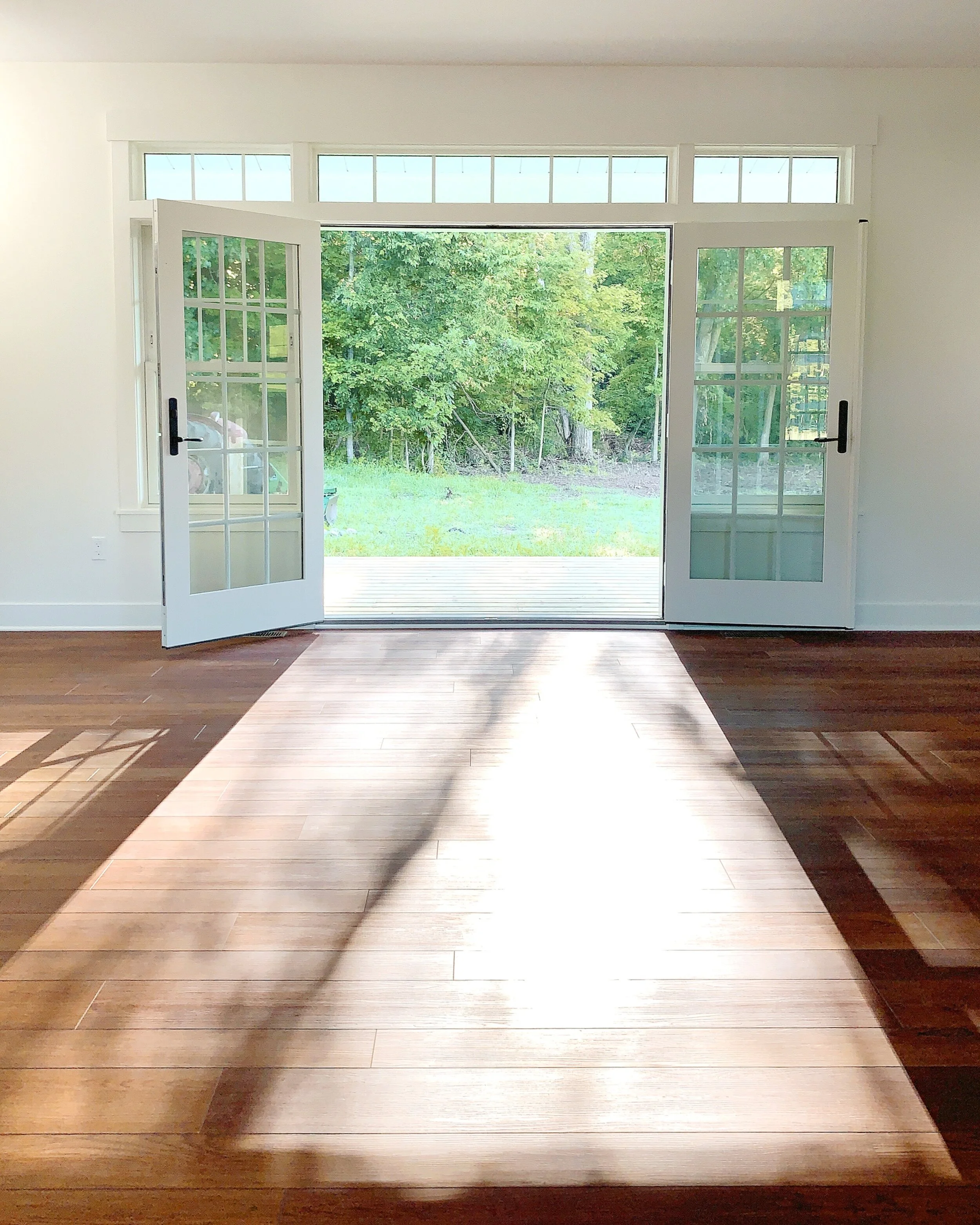
This stunning array is on the back of the living room and leads to the screen porch… I mean… so pretty. These photos were taken in the morning and the light just shoots through the house. Love. The ceilings in the house are all 9’ high so we wanted to do something large without overwhelming the room - I think this works well! The doors open flat against the walls so it just really increases the usability of the screen room.
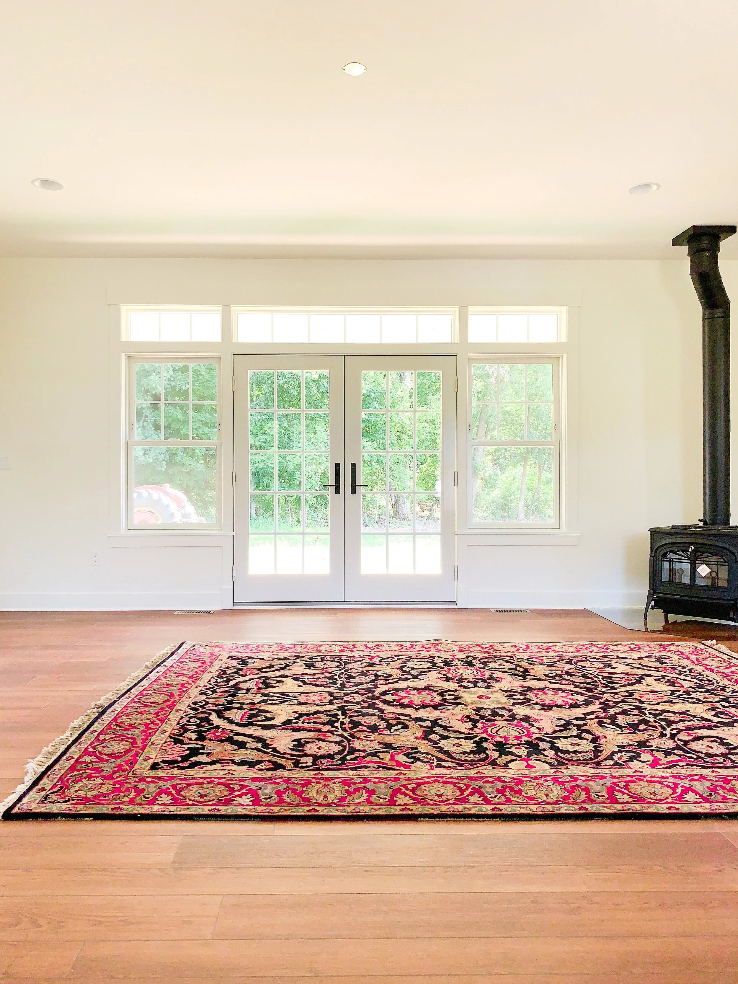
Have I mentioned I was taking these pics on moving day? Because I was. The wood stove had just been installed and the rug showed up! This photo taken from the same spot as the ones above shows how the scale and proportion of this setup is perfectly suited for the room.
Morning light flooding through the French doors into the Living Room
And here’s the living room from the screen porch looking in. It’s such a nice space!
One more Living Room pic! Mark made this beautiful gate for the stairs to prevent grandkids and dogs from wandering where they shouldn’t go.
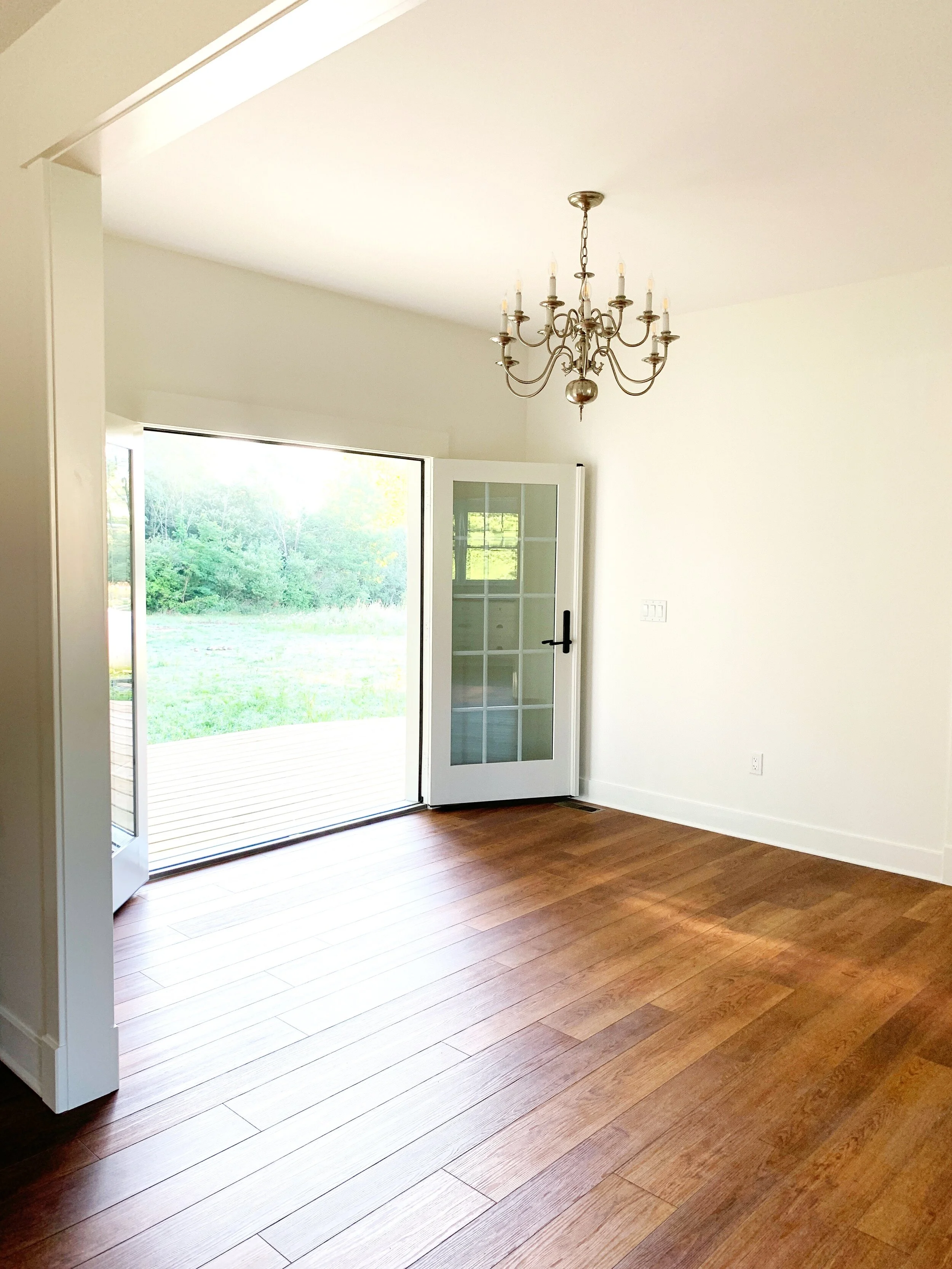
Sliding to the left, let’s peek through the French doors that lead to the Dining Room. Check out that symmetry! All the heart eyes for this view. The eating area on the screen porch opens to the Dining Room which opens to the kitchen. We always like to allow a lot of time in the planning phase because it’s details like this that really elevate the whole house!
In the Dining Room, the homeowners still wanted the functionality that the French doors offer, but also wanted to make sure the Living Room array was the focal point, so we opted to install just the French doors without transoms or other windows. The effect is really nice and you still have that seamlessness between indoor and outdoor living.
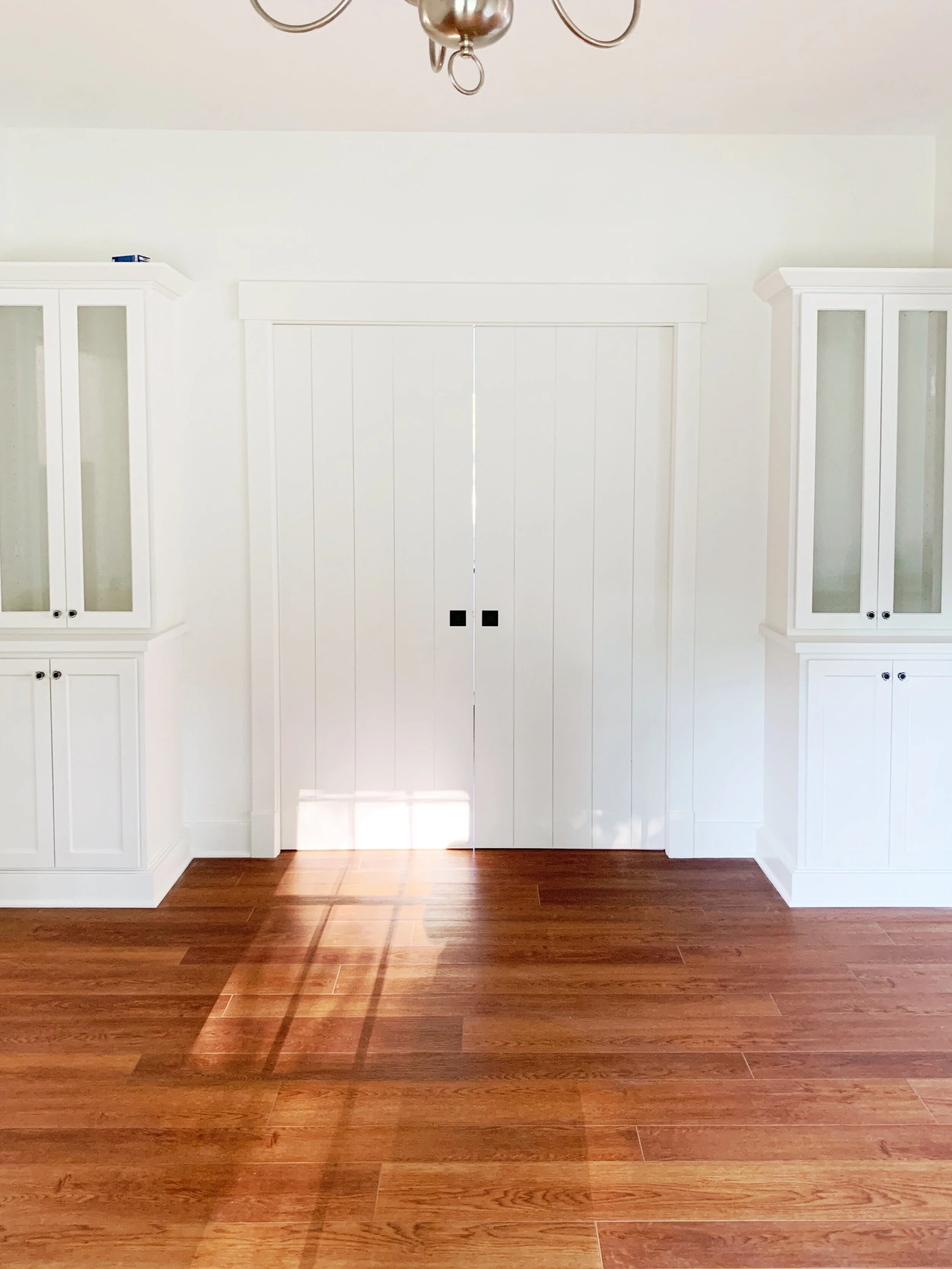
Here’s that view of the kitchen again with the pocket doors closed. We had all of the interior doors in the house custom made to mimic the vertical siding on the exterior of the home. (We often utilize repetition in addition to symmetry in our designs. It creates a unified home which is ultimately more comfortable to be in!)
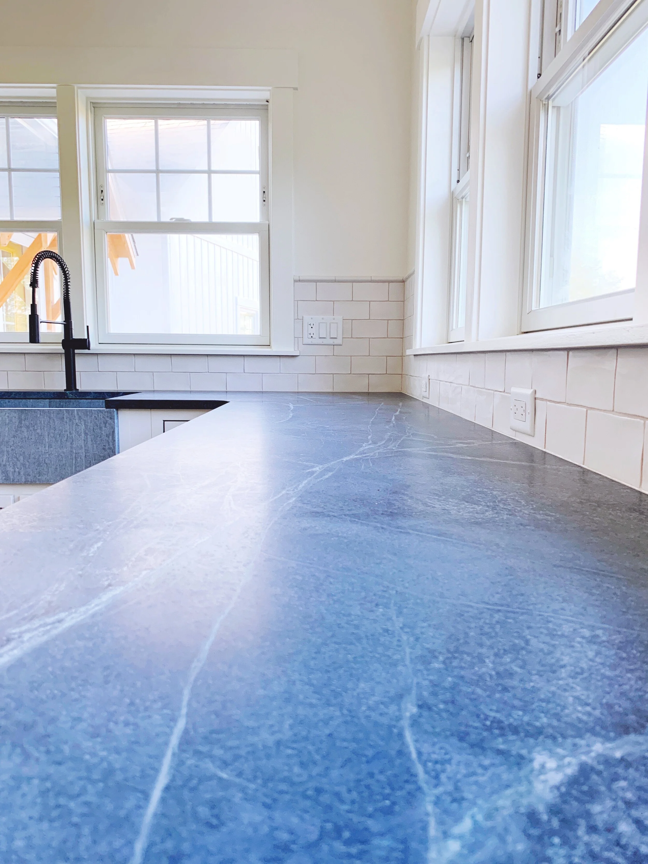
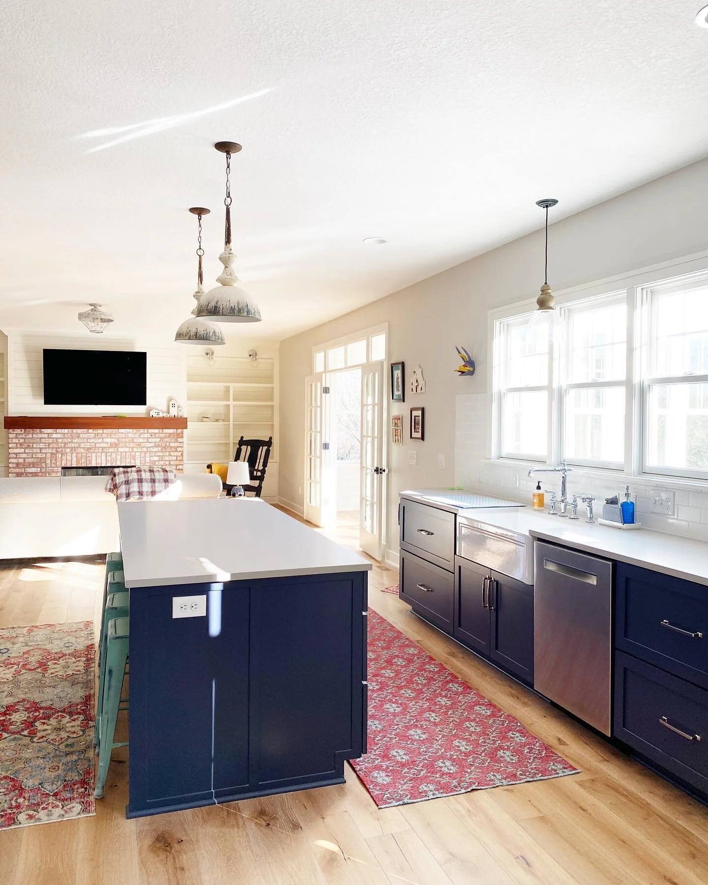
This kitchen is, hands down, the smallest kitchen we’ve ever designed. It’s like a little jewel-box and packs the punch of a room twice its size! Here are the three windows we see over the stairwell (continuity and symmetry FTW!) along with two more over the sink. The cabinets were locally made and there’s plenty of storage for the homeowners! I love a kitchen without upper cabinets - A. Because you can add ALL THE WINDOWS and, B. Because it makes the counters feel SO much more usable. This kitchen does have upper cabinets around the stove, as well as two cabinets which rest on the soapstone counters themselves.
Ok - that cabinet on the left - when you open the bottom set of doors you can see that the countertop runs right under, so the homeowners can easily slide their appliances in and out - so cool. Take a look out those kitchen windows, too…. you can see the beautiful Douglas Fir portico above the service door!
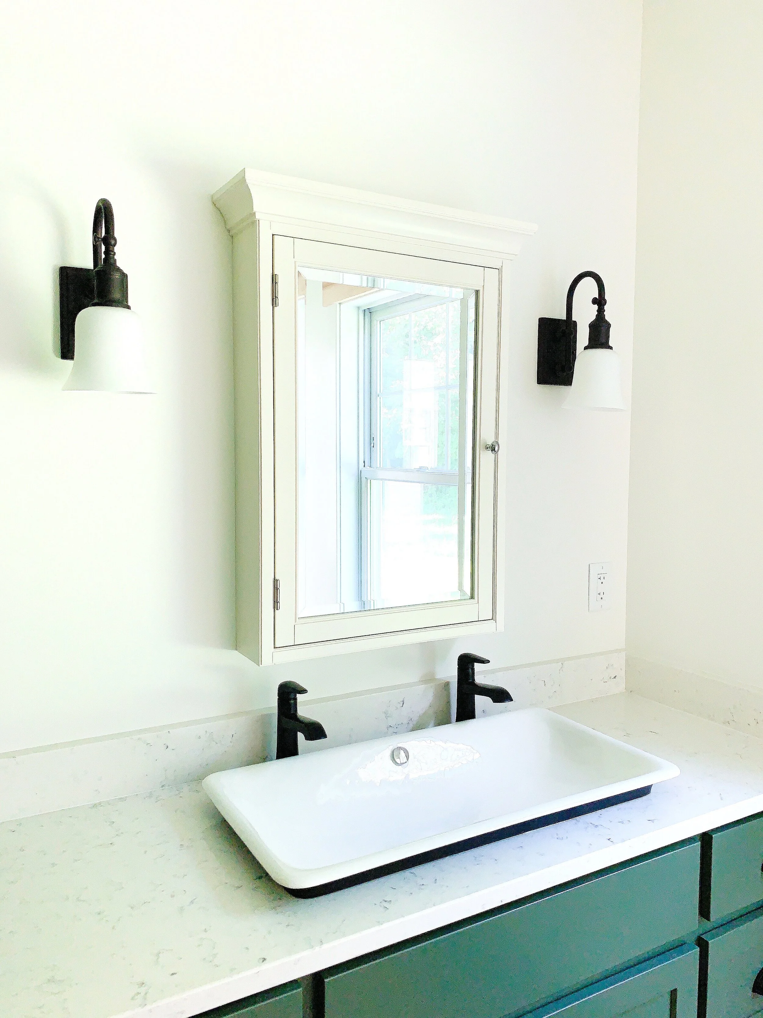
These clients have a special relationship with Vermont and purchased their kitchen sink as well as a bathroom sink from Vermont Soapstone and hauled them back to Michigan. Seeing the sink with soapstone counters - perfection!
Even though this kitchen is diminutive, it has to have one of the longest runs of uninterrupted work surface we’ve ever designed. In the original layout, the kitchen sink was located on the front wall of the house. By moving it to the side wall, this enormous open space was created! Imagine all the baking you could do in this kitchen!
This photo was taken before we finished, obviously, but it was the last one I managed to get of the backsplash tile over the range. Because this area is blocked off by the countertop cabinet and the refrigerator, we had the opportunity to do something a little different than the rest of the kitchen!
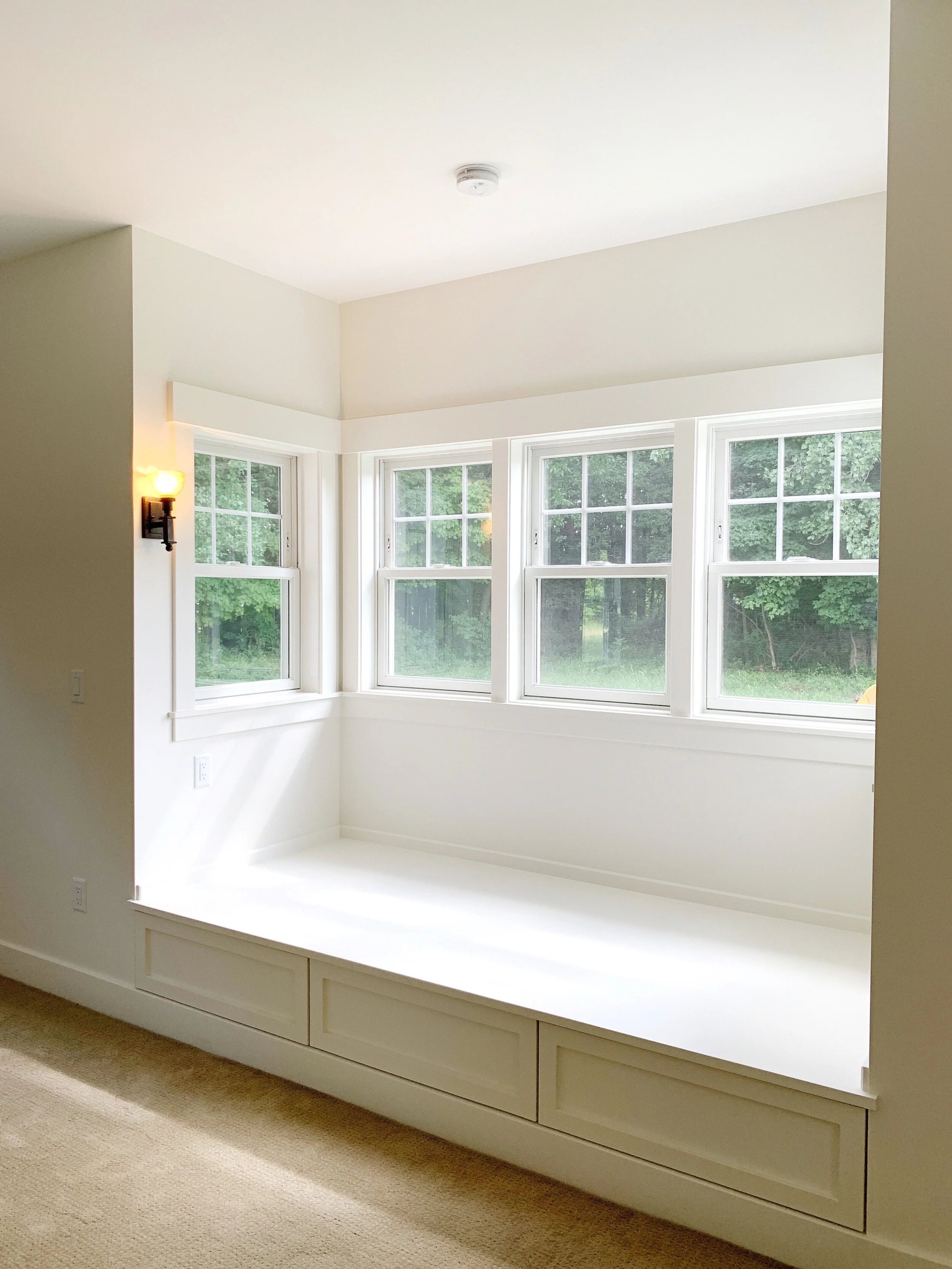
Ok, remember that door at the very end of the screened porch? That leads into the Owner’s Suite which is comprised of a large bedroom, bathroom, laundry room and closet. It also features the most beautiful AND functional daybed!
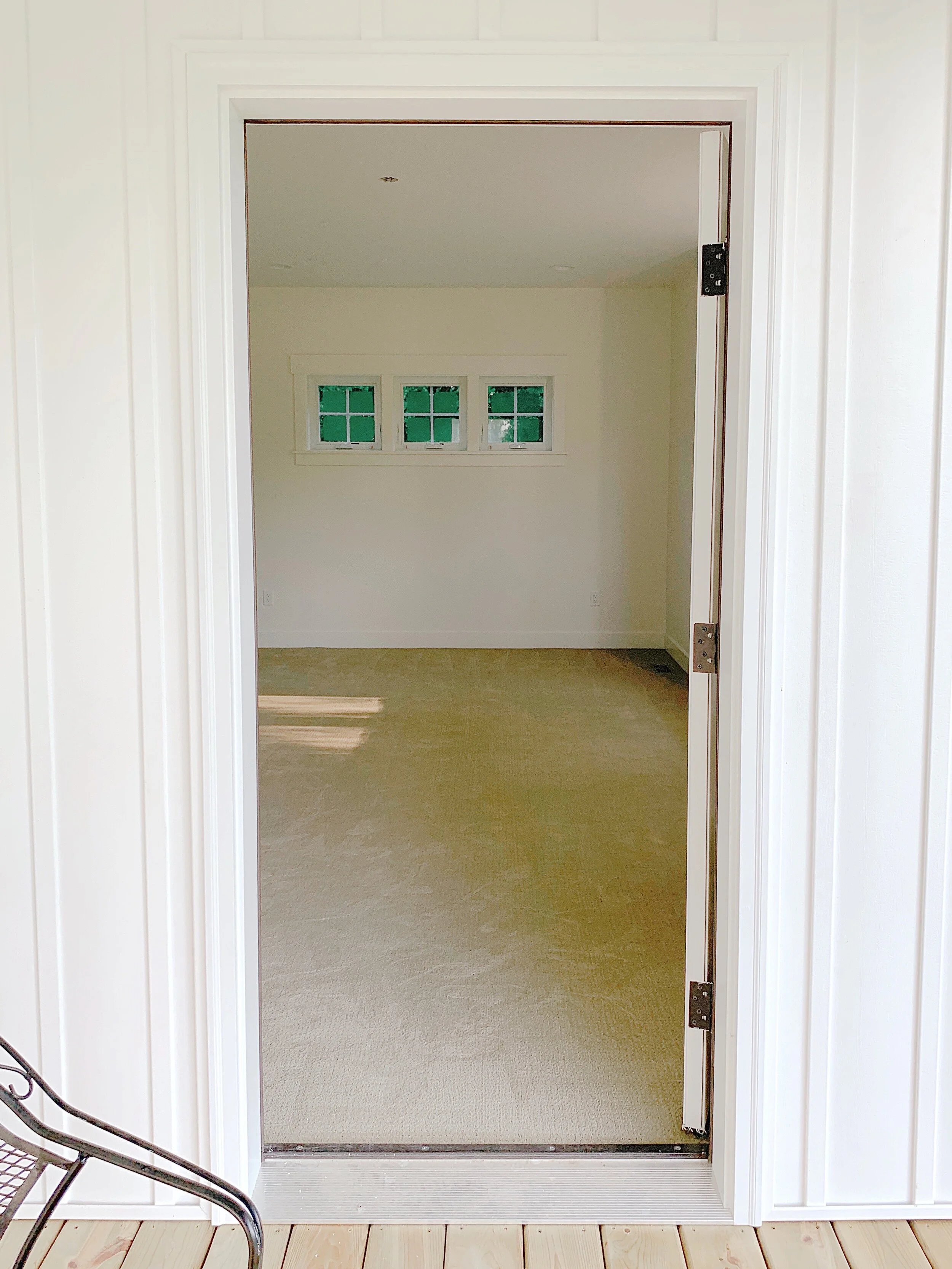
Here’s the Owner’s Bedroom from the door off the Living Room. You can see the sweet little daybed to the right. To the left are the closet, laundry and bathroom.
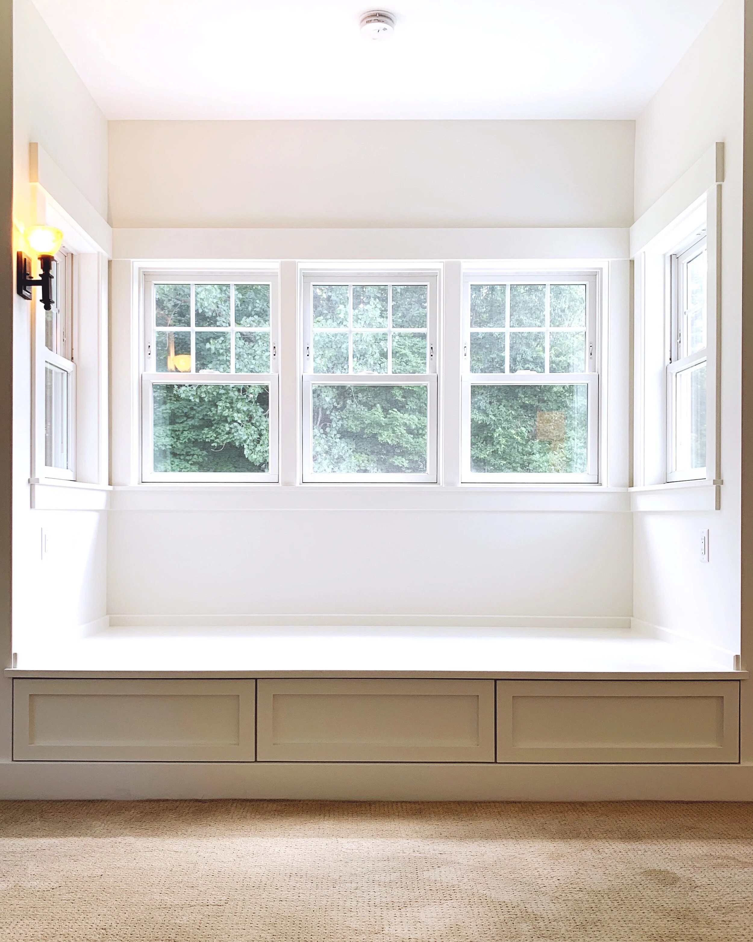
I have SO many photos of this daybed. I love the windows, I love the little antique sconce the owners found…
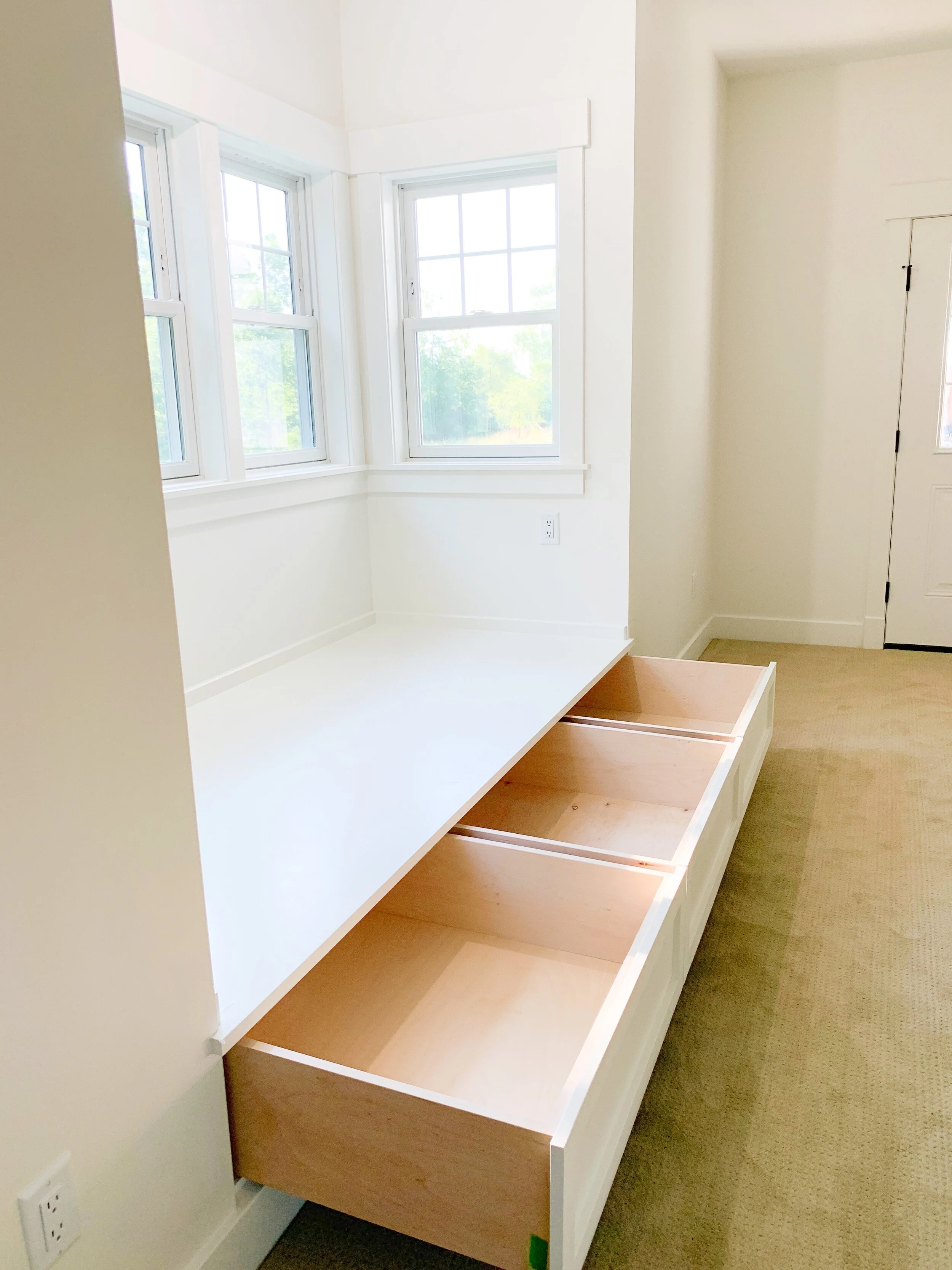
I love ALL THIS STORAGE! One of the great things about older homes is how the builders would incorporate lots of little storage areas and it’s something we try to replicate in our projects. Not only does it give homes a lot of character, it’s just so functional. These drawers extend a full 21” but the clients actually had us make them even deeper so they could put lesser used items toward the back.
And this - this is the view from the bed. Can you imagine waking up to this every morning? It’s such a cozy spot!
The Owner’s Bathroom features this large double shower - through the mirrored door is the laundry room and beyond that the large closet.
One of the things the homeowners really wanted was a nice long sink. I’m in love with the one they chose! It gives the functionality of two sinks while leaving a lot of counter space!
There are a few spaces I didn’t get a chance to photograph since we were basically finishing up the project as the clients were moving in! (They had a very specific timeline due to work and family commitments!) I wish I had photos of the mudroom, pantry and guest bath all finished! I’ll include some in-progress photos below and you’ll have to use your imagination to fill in the blanks!
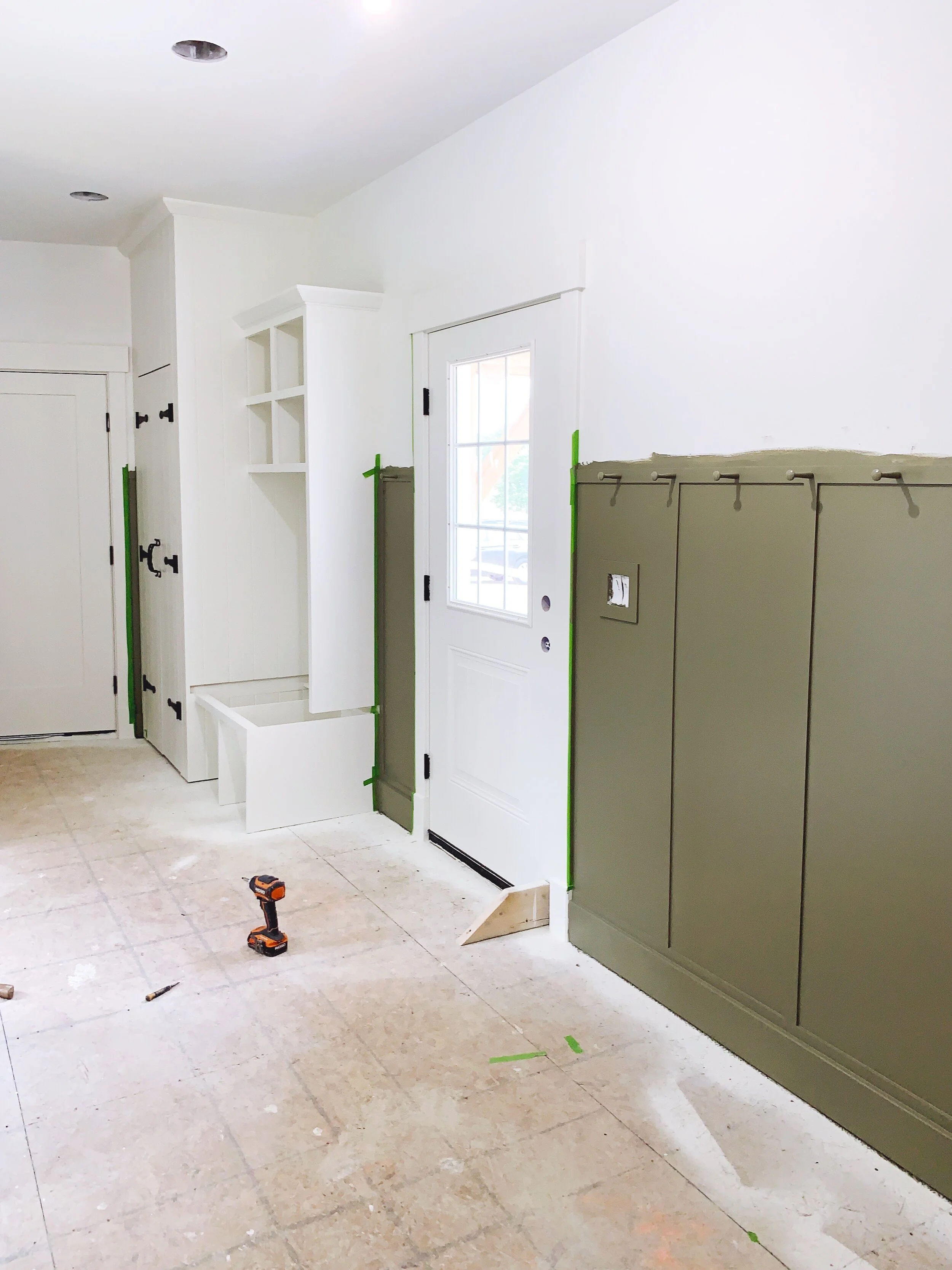
Here’s an in-progress pic of the mudroom. This is taken from the Dining Room, looking toward the garage. The door to the right is the one that has the little portico on the front of the house. To the left (out of view) are the guest bath, back door and pantry.) The clients chose the color of the wainscoting for a very sentimental reason - it’s the color of the house they’re moving out of!
This cabinet in the mudroom may be my favorite thing in the whole house. Mark built a very similar cabinet in our home, and I just love that it looks like it’s been there for 100 years. The homeowners selected this really gorgeous handmade wrought iron hardware that really lends to the built-in feeling. The bench next to it got a Birch butcher block seat that matches the stain of the pantry counter.
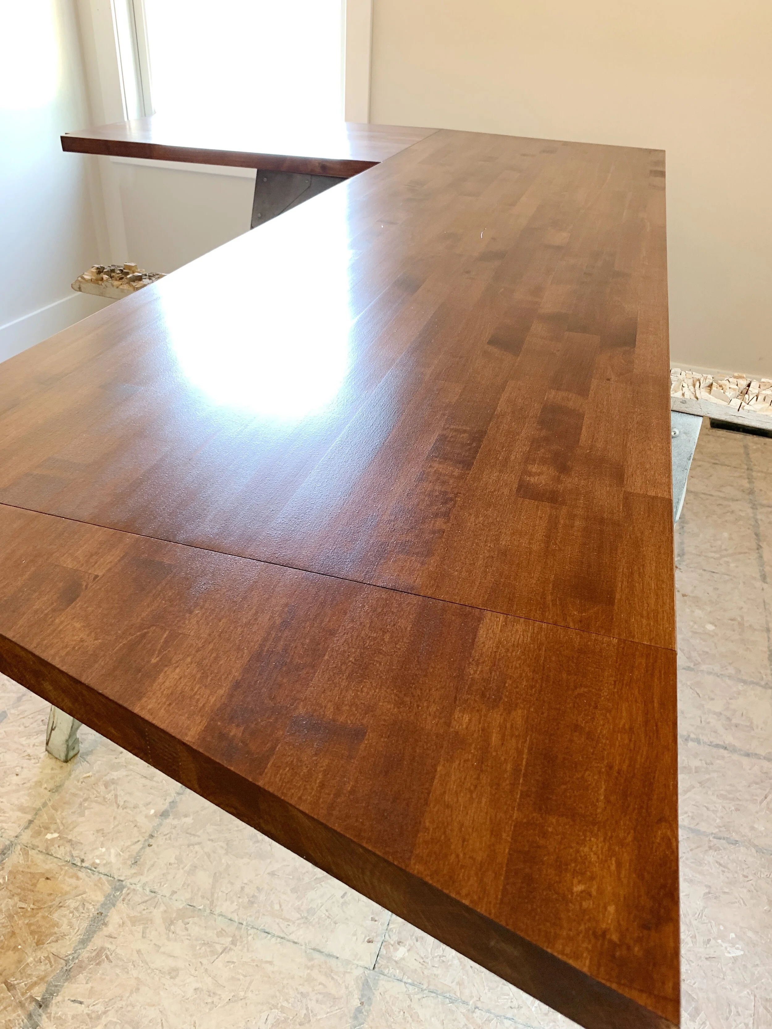
This is the counter for the pantry! It’s also Birch butcher block. Whenever possible we’ve started designing larger pantry rooms - more like a butler’s pantry… where you also store your food. It ends up being a great place to put your microwave and coffeemaker!
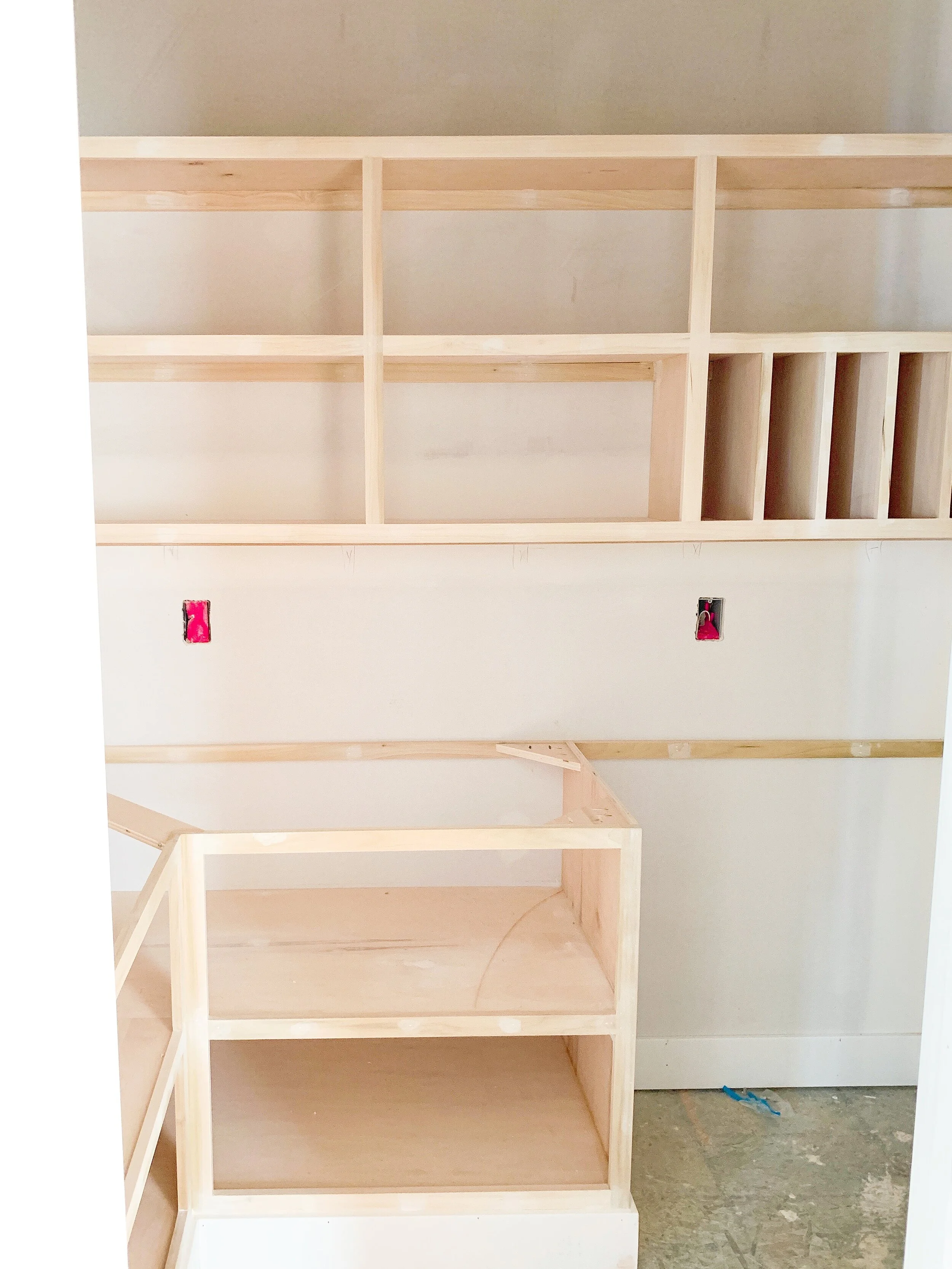
Here’s a very early photo of the pantry - the area to the right was left open so the owners could store high-use large items like dog food bins under the counter.
There it is! Pleasant Hill - caught in the COVID shutdown, and finally complete! Our next BIG project starts Monday…. more on that soon!
Pleasant Hill's Exterior
In my last post I talked about the new homeowners’ desire to have their house reflect a simple vernacular farmhouse style. They talked often about the types of home you see in New England, and as a former resident of Maine, I knew exactly what they meant! Vernacular homes are rugged and practical - sometimes you see as many as four or five “additions” which connect the house to the barn in order to shield the owner from harsh winter weather. The goal for Pleasant Hill was to keep it simple and timeless - a well-constructed building which will stand the test of time, with all the details of an older structure but including the amenities one might expect in a modern home.
The home was built in the middle of a large field full of natural plants and the homeowners are in the process of re-naturalizing areas disturbed during construction. Respecting the natural surroundings was of utmost importance. And while simplicity was the name of the game, the home is anything but boring!
The house is sited well off the road on a natural hill (thus the name!). The home faces West and with the abundance of windows, allows plenty of natural light from sun up til sun down. The new owners wanted a home which mixed both low-maintenance materials with natural “living” finishes, so we wrapped the entire home in vinyl board and batten siding. The windows have painted wood interiors and Fibrex wrapped exteriors. Cedar and Douglas Fir accents combine with the wood decks to lend a natural touch to the all-white exterior.
I wish you could smell this Cedar! *I took these photos as the electricians were finishing up, hence the lack of exterior fixtures! ;)
There are two entrances on the front of the house - the main entrance welcomes guests into the light-filled living room, while the service door leads into the large mudroom which contains a full bath, mudroom bench and pantry.
Clear Douglas Fir frames the portico over the front mudroom entrance
The front of the home presents an open and welcoming facade to its residents and guests alike. By setting the garage askew from the body of the home, we increased the privacy along the backside, which features a generous porch running the entire length of the building.
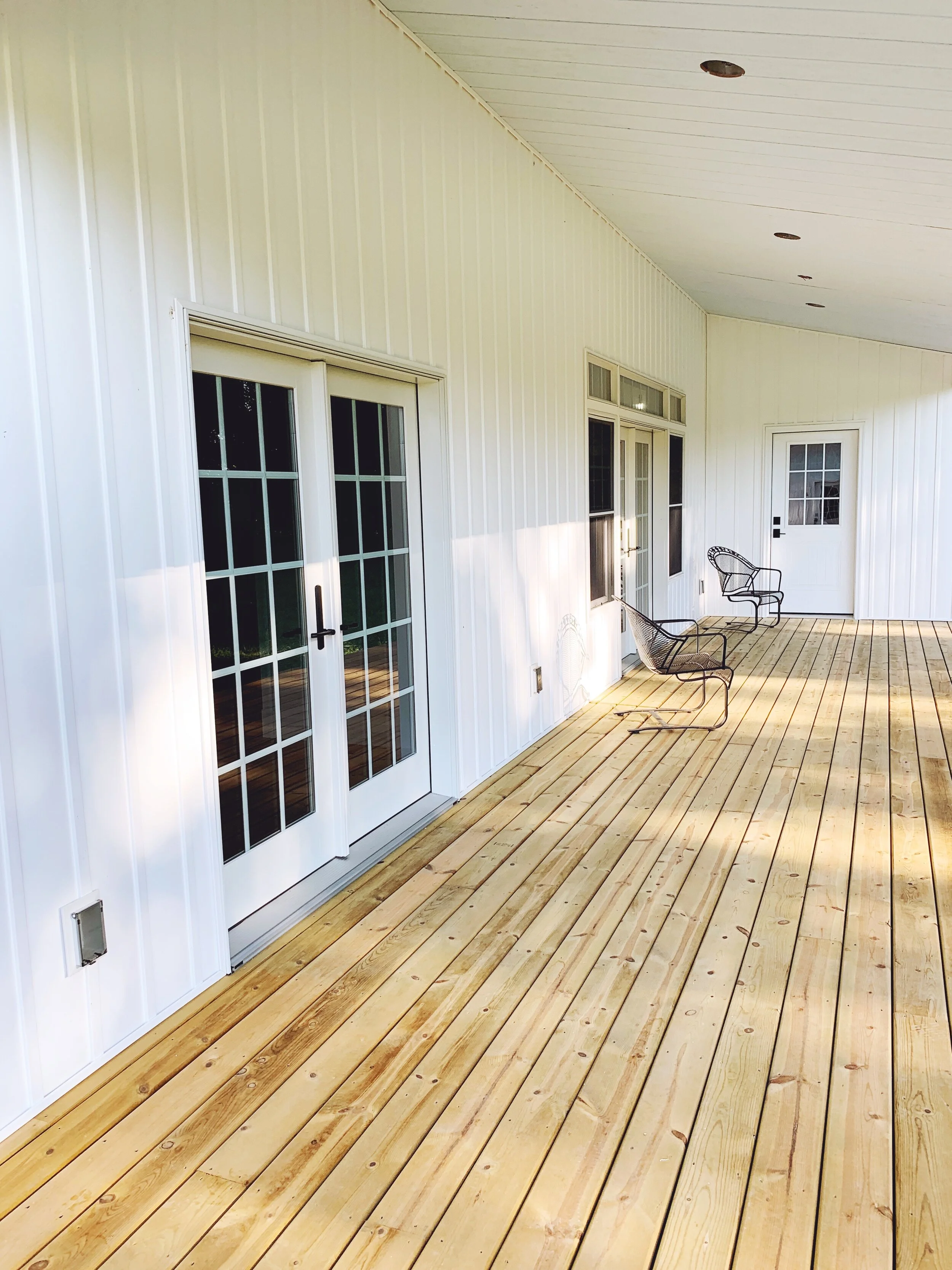
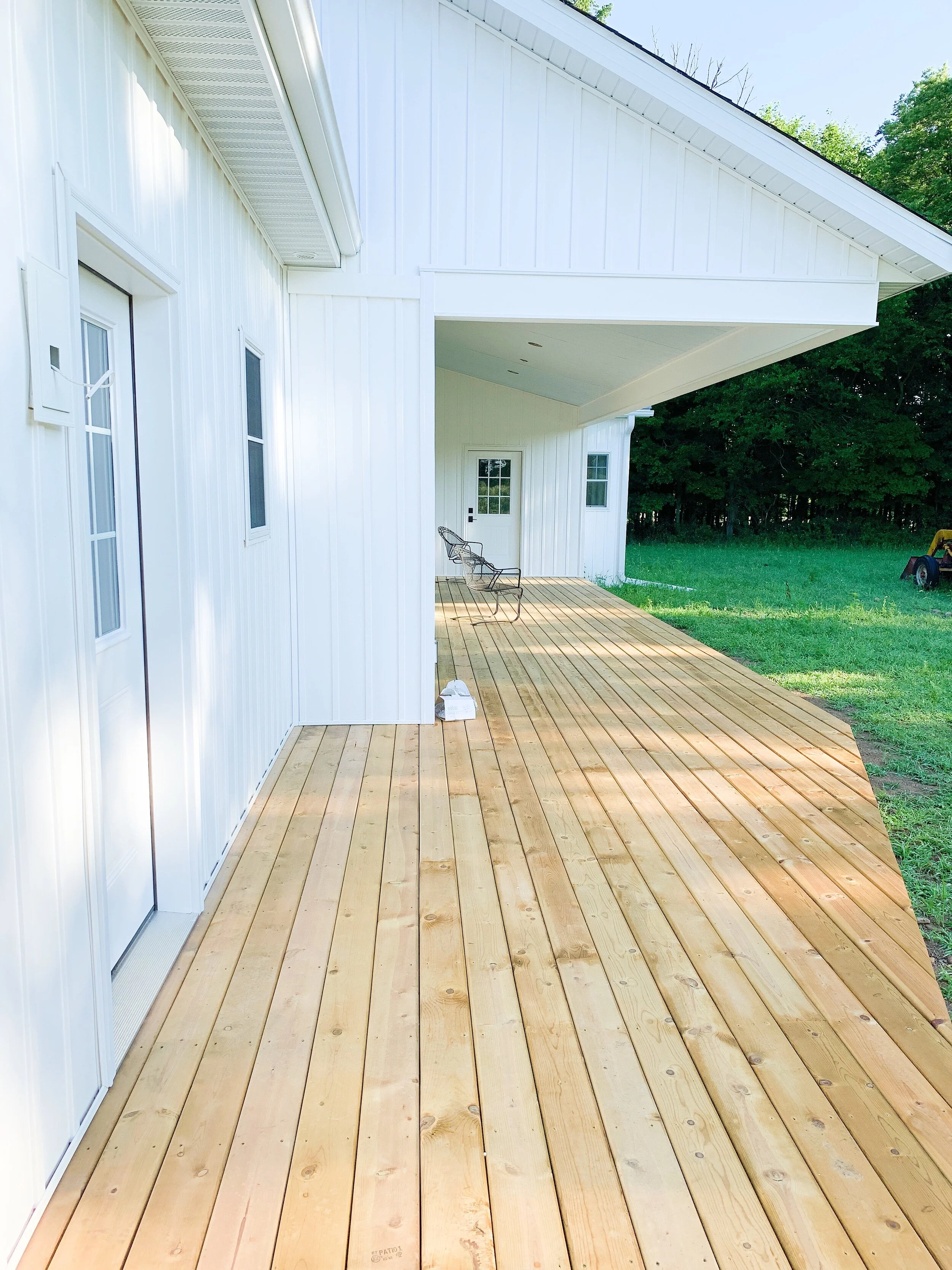
This is the BEST outdoor space. I’m taking this photo from the outdoor shower! The door to the left enters to the back side of the mudroom and is exactly opposite the door with the little portico. (Architectural tenants matter and sightlines are my favorite!) There will be screens wrapping the area contained by the porch roof. I have like 40,000 photos of this porch…
Moving in a little closer - this is the area that will be the screened porch. The first set of doors on the left enters to the dining room, and the large array of windows and French door beyond that enters to the living room. The door at the very end leads to the Owner’s Suite. With all of those doors open, the screen porch adds a huge amount of floor space to the home!
The ceiling of the screened porch is painted a faint blue
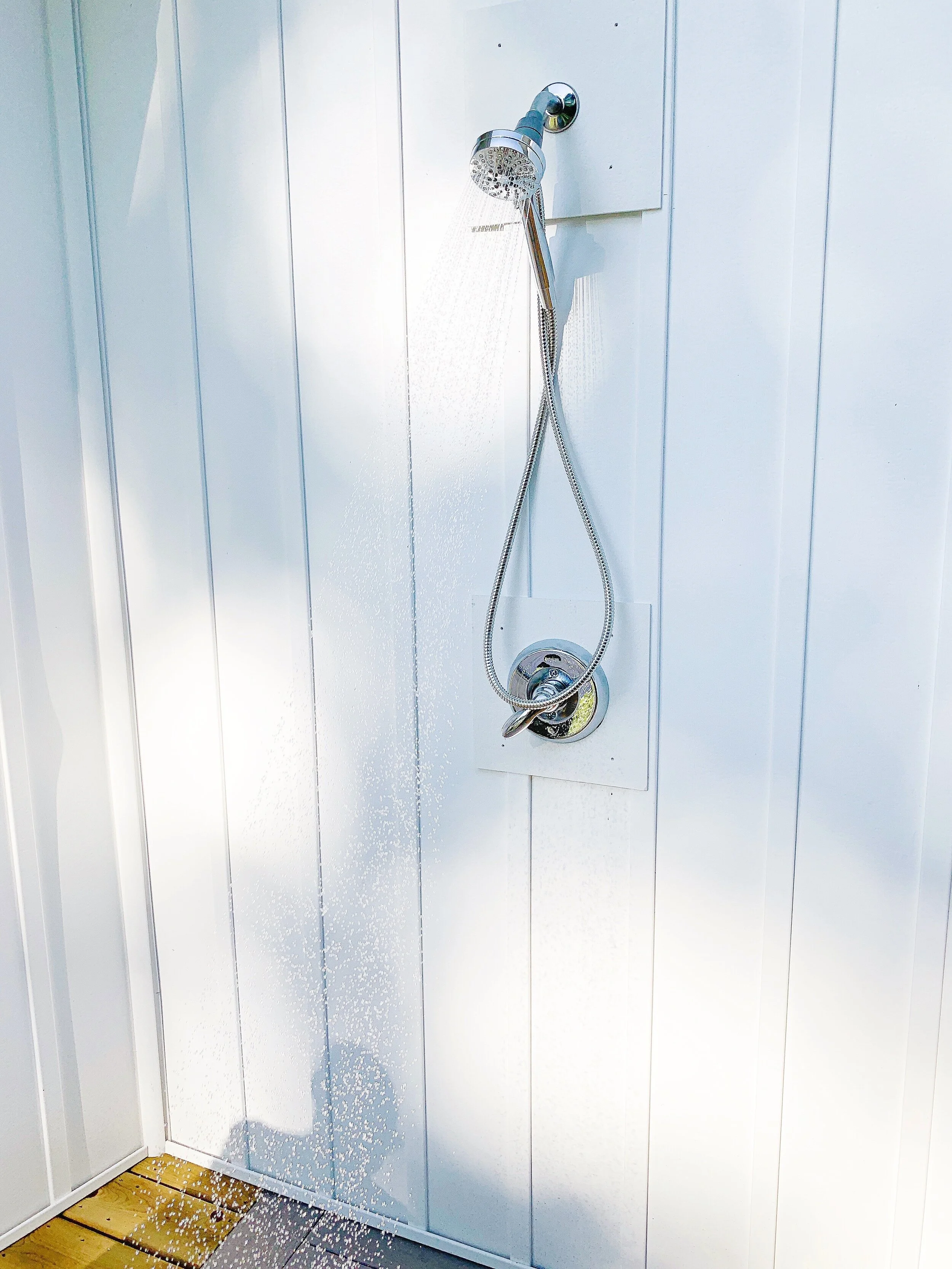
And now the best part of the exterior - the outdoor shower! It sits in a little alcove created by the garage and mudroom walls. We inlayed the treated wood deck with Azek decking under the shower, and Mark came up with an ingenious concealed drainage system to shuttle the water away from the house! Such a cool feature!
I was tempted to jump in - but I didn’t…
In my next post I’ll cover the interior which is even better than the exterior!
Welcome to Pleasant Hill
Welcome to Pleasant Hill! This was a project unlike any other we’ve ever done before, primarily because it sat, untouched, for 8 weeks during Michigan’s COVID19 quarantine. (Construction was not exempt from shut down in Michigan.)
Our clients, Amy & Joe, were very understanding of all the difficulties this period of uncertainty has brought, from total shut down, to product delays caused by the global pandemic, they were great! And now they’ve finally moved from their longtime residence into their brand new, fully custom home, Pleasant Hill. A big round of applause to all the subs who worked tirelessly to get this project fast tracked after the shut down!
When we first met, Amy & Joe had purchased a set of plans they liked, but didn’t really suit their exact needs - so we decided to start again from scratch, putting pencil to paper and figuring out exactly what they wanted from their new home. Some items on their list included:
Comfortable living for two people
All inclusive owner’s suite
Comfortable guest accommodations
A simple design which would compliment the existing barn and the naturalized landscape
A design that would feel rustic but not overworked
Incorporation of a vernacular farmhouse style
A good combination of openness and privacy
Plenty of windows and interior doors in order to take advantage of the incredible breeze and natural light


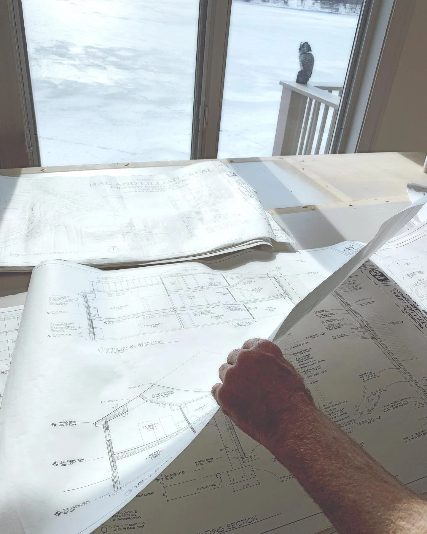
Over the course of several months, we worked together on the layout - above you can see a few of the iterations… the final layout is a little different still!
We were so happy to have been a part of bringing Pleasant Hill to life! The clients ended up with a beautiful new home filled with light and distinctive touches - we’ll be sharing more in the coming days!
Cedar Lake Cottage Tour!
When our clients first brought us out to take a look at their new home, we were blown away... for a few reasons. On the good side, the home was sort of a blank slate, and it also featured one of the prettiest lake views I'd seen in awhile. Although it was pretty small for this family of 5 and had more than a few quirks, we saw the potential right away and I couldn't wait to get started on the design. By adding just a 10' deep by 30' long addition to this 1970s era cottage, we were able to transform the space from dark and cramped to light, bright and open - with 180 degree lake views as a bonus! {Make sure you scroll to the bottom of this post - I included a guided walk through video!}
Let's start at the beginning - this is the view when you enter the home. It's changed just a little bit! What you can't see from the before photo below is that the stairway to the basement was totally closed in. When you walked in the front door, you could barely see the lake and the entry was very cramped. By removing a portion of that wall and replacing it with open handrail, it completely changed the feeling when you enter the home.


From this view, you can see where we opened up the wall to the basement as well as the big, bright new kitchen/dining room! You can look at it, but only for a minute - don't get distracted, yet. This great room area originally served as both the living AND dining rooms. While it's a pretty good sized space, it isn't nearly large enough for both uses with a family of five moving in. We knew right away we wanted to reclaim this space for living room use only. And we also knew we'd want shiplap on that ceiling! Hallelujah!


We're inching closer to that kitchen, people!!! Here's the view looking back into the house from the lake side. On the right we also removed a closet, which might seem counter intuitive, but it opened the entry enough that the homeowners could have a little mudroom space. This home only has one entrance so it's used by both guests and residents. Having a little extra space there more than offsets the lost closet.
get the look: floor // coffee table // lake sign
Ok, here's a better view of the entry. We replaced the door with something a little more welcoming but also with a little more privacy. Imagine that area by the door as about a 3' x 3' landing and you'll understand why getting rid of those walls was so critical. This is a pretty good picture of the floor, too - COREtec's Blackstone Oak. It's LVT, which stands for Luxury Vinyl Tile. We LOVE this stuff - especially for young families or lake houses - it's fantastic. Fully vinyl, it's impervious to water, pets, kids - you name it.
You guys, this was the kitchen in the original house. Let's just sit with that for a minute, shall we? You may have some questions here - one might be, "How could you open the refrigerator and walk through the kitchen?" or maybe, "Why is there a ceiling fan in there?" Let me help you out with some answers. This was a one person kitchen and even then it was tight! Also... Heated. Ceilings. Yup. Heated ceilings. Bizarre. So all the ceiling fans were to push the warm air down into the living space. This one also made it impossible to open some of the upper cabinets...
And THIS is the kitchen now. Well, kitchen AND dining room. By adding 10' to the width of the kitchen above, we got this - 18 glorious feet of kitchen, with enough room to eat in. Angels are weeping over its beauty as we speak.
get the look: pendants // cutting board // cabinet hardware // sink // faucet // mixer // towels // table
You guys know I basically have a phobia of upper cabinets and this kitchen was no exception. Why live on a lake if you can't see it!? We'd originally planned for the five windows on the sink wall and then just the full light door going out to the deck. But then during framing, it became clear that those two extra windows were CRITICAL! I just couldn't imagine standing in that house and losing even an inch of lake view if we didn't need to. So a couple extra windows got ordered and a wall got re-framed (sorry, Mark!) But seriously - views > storage, amiright???
get the look: pendants // table // sink // tea towels // cutting board // faucet // blue vase
This is basically bragging at this point - I mean - who gets 180 degree lake views!? It's obscene! This house sits up off of the lake, too, so it's like living in a treehouse surrounded by gorgeous, sparkling water. I may be a little jealous!
get the look: pendants // table // blue vase // cabinet hardware // cutting board
Because of the limited square footage at this home, it was important for us to keep things as flexible as possible. By utilizing a dining room table instead of a built in island, we kept the feeling of the home cozy, while allowing for multiple seating arrangements during large gatherings.
get the look: pendants // table // blue vase // sink // tea towels // cutting board // faucet
Here's a pretty good look at how open the kitchen is to the living room. I know at our house, everyone always ends up in the kitchen, but here it's nice to be able to have conversation flow between the rooms. It gives the home, which is just around 1300 SF on the main level, a real feeling of spaciousness.
Our clients chose to have us custom build and finish these tall cabinets in our shop. Because we replaced upper cabinets with windows, we needed to find more storage for them in the kitchen. These cabinets are beautiful AND functional, serving as a pantry and place to hide the microwave!
Taking the subway tile backsplash just to a standard 18" on the window wall allowed for a splash of this beautiful wall color to be displayed, while taking it to the ceiling on the stove wall gives the space a touch of cottage glam. Because the beam in the living room had to stay (it's structural), we decided to run with it and bring in some warm tones, too. This house is a great example of how you can really mix wood tones. The flooring keeps its tone well with the paint colors and decor, which allows for a warmer accent tone to be brought in. The custom made floating shelves are extra heavy duty. We stained them and the range hood both to match the living room beam.
get the look: metal basket // mixer // bottles // knife block
One more of the windows. I can't help it - they're so pretty! Fun fact: We ordered the windows to all open the same direction - so they can catch the breeze off the lake in the summer and cool the house.
get the look: sink // cabinet hardware // tea towels // cutting board // faucet
And now for something new... a video tour! I probably wanted to say the word incorporate a few more times... cringe! But here it is - it gives you a sense of how light and open the house really feels.
And there it is! We also used some of the addition space to gain a walk in closet and bathroom to create a master suite for our clients - which was a huge bonus!
{this post contains affiliate links}
5 Easy Ways to Show Your House Some Love This January
2018 has gotten off to a pretty frigid start for most of the country and our town is no exception. It's too cold to do anything - at least it feels like it! But today we're going to share 5 quick things you can do to show your house some love (or as some people call it, "maintenance" but that doesn't sound nearly as fun). This isn't a comprehensive list, but it's a good place to start - it'll help you get over that cabin fever in no time!
1. Check Your Attic
If you've never looked in your attic, now's the time. Let me back up... if you don't know how to access your attic, now is the time to learn! Does your house have icicles? It shouldn't!
You will need:
- A sturdy step ladder
- A Flashlight
- A Ruler or Measuring Tape
How To:
- First, locate your attic hatch. This is usually a small rectangular panel located on your highest floor. It's most likely in a closet, so don't give up if it takes you a minute to find it!
- Set up your ladder under the hatch, making sure it's fully opened and stable.
- Using the ladder, push the hatch open - you may want to wear some glasses - blown cellulose insulation is messy!
- Once you're high enough to see into the attic, break out the ruler and your flashlight. You're looking for at least 16" of depth for your insulation in Northern climates.
- If you've got 16" or more - fantastic! Check again next year!
- If you don't have 16" of insulation, call your local insulation company and let them know that you'd like to make an appointment to have your attic insulation topped off. They'll know exactly what you mean and will be happy to give you an estimate on the work!
2. Find Hidden Dirt
Even if you're a fastidious housekeeper, you probably have a few areas where dirt and dust accumulate. We're talking registers and vent covers, here. Winter is a great time to clear out the cobwebs and keep the air in your home fresh and allergen free! This can also be done for your dryer vent and range hood. If you've never cleaned your range hood filter, well, you're in for a special treat!
You will need:
- A vacuum
- A dishwasher (or sink, sponge and soap!)
- A flat head screw driver
- Dust mask (this makes it sound like a big deal, but trust me, you'll want one when those fine little particles start flying!)
- A teeny tiny amount of elbow grease
How to:
- At each air supply or return, first remove the cover, using the screwdriver if wall mounted.
- Vacuum off the cover.
- Vacuum inside the duct, as far as you're able.
- Wipe down wood covers with a damp cloth.
- Clean metal covers in the sink with soapy water OR stick them in your dishwasher!
- Replace!
- If you suspect that your ductwork may have accumulated dust and pet dander, it might be a good idea to call in the pros. Find a reliable company locally who can come in an sweep out your ductwork - this is especially useful if you have any allergy sufferers in your home!
3. Replace ALLLL Your Filters
I can get especially lazy about doing this... our refrigerator filters *may* or may not have needed to be replaced for something like three months... So... no time like the present! This is a really simple task that can save you energy and money.
You will need:
- Your filters
- A flashlight
- Both standard (flat) and phillips head screw drivers
How to:
- Make a list of all the appliances and mechanical units in your home that have replaceable filters - you'll be looking for things like refrigerators, air filtering units, humidifiers, dehumidifiers, furnaces, etc.
- Locate the appliance model number. Companies usually put this on a sticker located either on the back or side of an appliance, or sometimes inside the door, in the case of refrigerators. Sometimes, in addition to the model number, they'll actually give you the model number of the filter, as well - bonus! Write all of these down a piece of paper.
- Head over to Amazon, and search for the filters you need. If you're a better person than me, you'll set these up to auto-send - refrigerator filters should be replaced every three months, with most other filters being replaced yearly.
- When your filters arrive, you can get started on the swap out! Quick tip: Do NOT remove all the filters at one time!
- At each appliance, have your filter and flashlight. Pay very close attention to the direction and positioning of the filters when you remove them. Many will have directional arrows. I've found it's helpful to remove them and set them aside EXACTLY as they came out.
- After you've removed the old filter and done a little gagging, you're ready to slide your brand new filter into place! Pop that baby in, and make sure you properly install the cover.
4. Test Your Warning Systems
January can be a dangerous time in people's homes - it's very cold, many people are heating with space heaters and gas fireplaces - our furnaces are chugging away, struggling to keep up. It's vital that your warning systems are functioning properly.
You will need:
- A sturdy ladder
- Some hearing protection (not vital, but you'll thank me)
- Lots of fresh batteries
How to:
- First, locate all of your smoke detectors. Residential codes require them to be located inside and outside every sleeping area, and to communicate with each other, which means if one goes off, they all go off. If your home is older, it may not be up to code.
- Test your smoke detector, by pressing the button on the cover of the alarm until it sounds (usually about 5 seconds). If it doesn't sound, replace the batteries and test again. If it STILL doesn't sound, head to the next step.
- You may need to replace your existing smoke detectors (especially if your units are over 10 years old) or you may want to add a few units to your home.
- We recommend replacing your existing units with these great ones which also include CO detection. They're wireless, and they work with each other, giving you that interconnected feature!
- If you're not comfortable replacing the units yourself, call a pro to help you out - having an electrician install your smoke detectors is worth every penny and will definitely be less expensive than the aftermath of a fire.
5. Take a Walk Around the House
It's easy to hunker down inside during the winter! And because most of us are leaving and coming home in the dark, the outside of our homes can get neglected. By taking an observational walk around the house during the winter, you can identify and possibly address some potential issues.
You will need:
- A clear day
- Your eyes!
How to:
- On a clear day, during daylight hours, bundle up and head outside.
- First, walk around and take a look at your roof and gutters - do you have a lot of ice? Are there any shingles or pieces missing from the soffit or fascia?
- Next, check out your landscaping and trees. Winter is a great time to do this because all of the leaves are down. Is your landscaping far enough away from your home to allow for proper air flow and drainage? Are there any trees hanging over your roof or growing too close to decks, porches or sidewalks?
- Make a list of anything you see that might need to be addressed.
- Do as much of the work as you feel comfortable with, but otherwise, January is a great time to call a professional. Landscapers' schedules fill up quickly, so if you have some issues that need to be fixed, call now to get on the schedule when the weather breaks!
Surprise!
Happy New Year! Surprise - we're starting 2018 with a brand new blog! Through the course of our meetings with clients, we get a lot of questions and we thought it might be fun to try and answer some. We'll be writing on a whole range of topics, from ways to show your house some love (some people call it "maintenance" but that doesn't sound like very much fun), buying guides and how-to posts. We've got tons of ideas all ready to share, but if you have questions or topics you'd like us to explore, let us know!
After 30 Years, A Colonial Home is Transformed
After 30 years, a Colonial home is transformed... click through to gallery.


Hey there! We're Mark & Angi. We're the owners of PCW design/build. Together we've worked on countless projects over the last 20 years and now we're ready to share a little (or a lot!) of what we've learned with all of you! More about us here...
SHOP FRESH FINDS


SHOP OUR FAVORITES
FOLLOW US ON INSTAGRAM
{This sidebar contains ads and affiliate links}
