
Dining Room Chairs
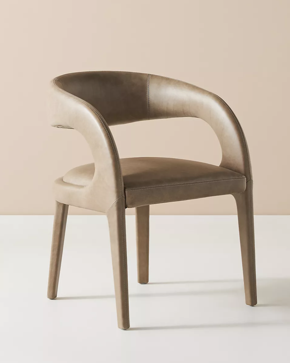
We’ve been on the hunt for the perfect dining room chairs for our current project at Pheasant Pointe. Our clients really love the classic CH24 Wishbone chair, but for a family with small kids around, the woven seat is not a great option. After a lot of deliberation we chose Anthropologie’s Leather Hagen Dining Chair. It embodies the low-slung sleek lines of Danish Modernism but the leather makes it ultra comfy and, more importantly, cleanable! I think they’re the perfect choice! It’s also available in velvet and cozy boucle.
While we were looking for our Goldilocks “just right” chair, we found SO many other great options - check them out! (Make sure to scroll to the bottom for a bonus chair!)


The original CH24 Wishbone Chair designed by Hans J. Wegner for Carl Hansen & Søn in 1949. Available in a wide range of colors and material, staring at $947

Drumawillen Side Chair - this is a fantastic budget-friendly option - a set of two chairs is under $200! This is actually a knockoff of another Carl Hansen chair - CH20, The Elbow Chair.

Rylie Dining Chair from Anthropologie - $298.00 - Doesn’t this chair look so comfy? I love the leather (available in 4 colors) with the contrasting top stitching.

Savis Chair by Article - $299 - I just love this chair - it was a close runner up to the chair we ended up selecting!

Ripple Chair by Industry West - $199 - Not only is the shape of this chair so cool, I love the visual lightness of it as well. It’s available in four great colors, too!

Keva Upholstered Dining Chair by Pottery Barn - $279 - First - this color! So gorgeous - this chair would be great in both formal and informal dining areas. Really pretty.

Baldwin Dining Armchair by Williams-Sonoma - $395 - This is a great update to the original Wishbone Chair - it maintains the line of the chair but feels a little more grounded.

Taika Leather Dining Chair by Safavieh - $292 for a set of 2 - How cool is this chair? Really great shape combined with leather webbing? Love it. Would also be great as a foyer chair!

Wexler Dining Chair by Target - You guys, these chairs are a STEAL! $161 for a set of 2. This update to the Wishbone Chair might be my favorite yet - the solid seat, the fun colors? Love them!

BONUS CHAIR! It didn’t make the composite, but this chair - it’s a beauty! Kai Arm Chair from All Modern - $411 - This chair is so simple, no energy is wasted on anything unnecessary, and yet it still has so much style.
Cedar Lake Cottage Tour!
When our clients first brought us out to take a look at their new home, we were blown away... for a few reasons. On the good side, the home was sort of a blank slate, and it also featured one of the prettiest lake views I'd seen in awhile. Although it was pretty small for this family of 5 and had more than a few quirks, we saw the potential right away and I couldn't wait to get started on the design. By adding just a 10' deep by 30' long addition to this 1970s era cottage, we were able to transform the space from dark and cramped to light, bright and open - with 180 degree lake views as a bonus! {Make sure you scroll to the bottom of this post - I included a guided walk through video!}
Let's start at the beginning - this is the view when you enter the home. It's changed just a little bit! What you can't see from the before photo below is that the stairway to the basement was totally closed in. When you walked in the front door, you could barely see the lake and the entry was very cramped. By removing a portion of that wall and replacing it with open handrail, it completely changed the feeling when you enter the home.


From this view, you can see where we opened up the wall to the basement as well as the big, bright new kitchen/dining room! You can look at it, but only for a minute - don't get distracted, yet. This great room area originally served as both the living AND dining rooms. While it's a pretty good sized space, it isn't nearly large enough for both uses with a family of five moving in. We knew right away we wanted to reclaim this space for living room use only. And we also knew we'd want shiplap on that ceiling! Hallelujah!


We're inching closer to that kitchen, people!!! Here's the view looking back into the house from the lake side. On the right we also removed a closet, which might seem counter intuitive, but it opened the entry enough that the homeowners could have a little mudroom space. This home only has one entrance so it's used by both guests and residents. Having a little extra space there more than offsets the lost closet.

get the look: floor // coffee table // lake sign
Ok, here's a better view of the entry. We replaced the door with something a little more welcoming but also with a little more privacy. Imagine that area by the door as about a 3' x 3' landing and you'll understand why getting rid of those walls was so critical. This is a pretty good picture of the floor, too - COREtec's Blackstone Oak. It's LVT, which stands for Luxury Vinyl Tile. We LOVE this stuff - especially for young families or lake houses - it's fantastic. Fully vinyl, it's impervious to water, pets, kids - you name it.

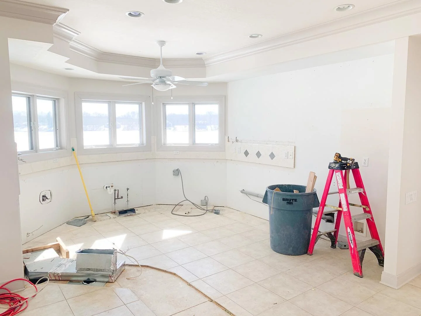
You guys, this was the kitchen in the original house. Let's just sit with that for a minute, shall we? You may have some questions here - one might be, "How could you open the refrigerator and walk through the kitchen?" or maybe, "Why is there a ceiling fan in there?" Let me help you out with some answers. This was a one person kitchen and even then it was tight! Also... Heated. Ceilings. Yup. Heated ceilings. Bizarre. So all the ceiling fans were to push the warm air down into the living space. This one also made it impossible to open some of the upper cabinets...

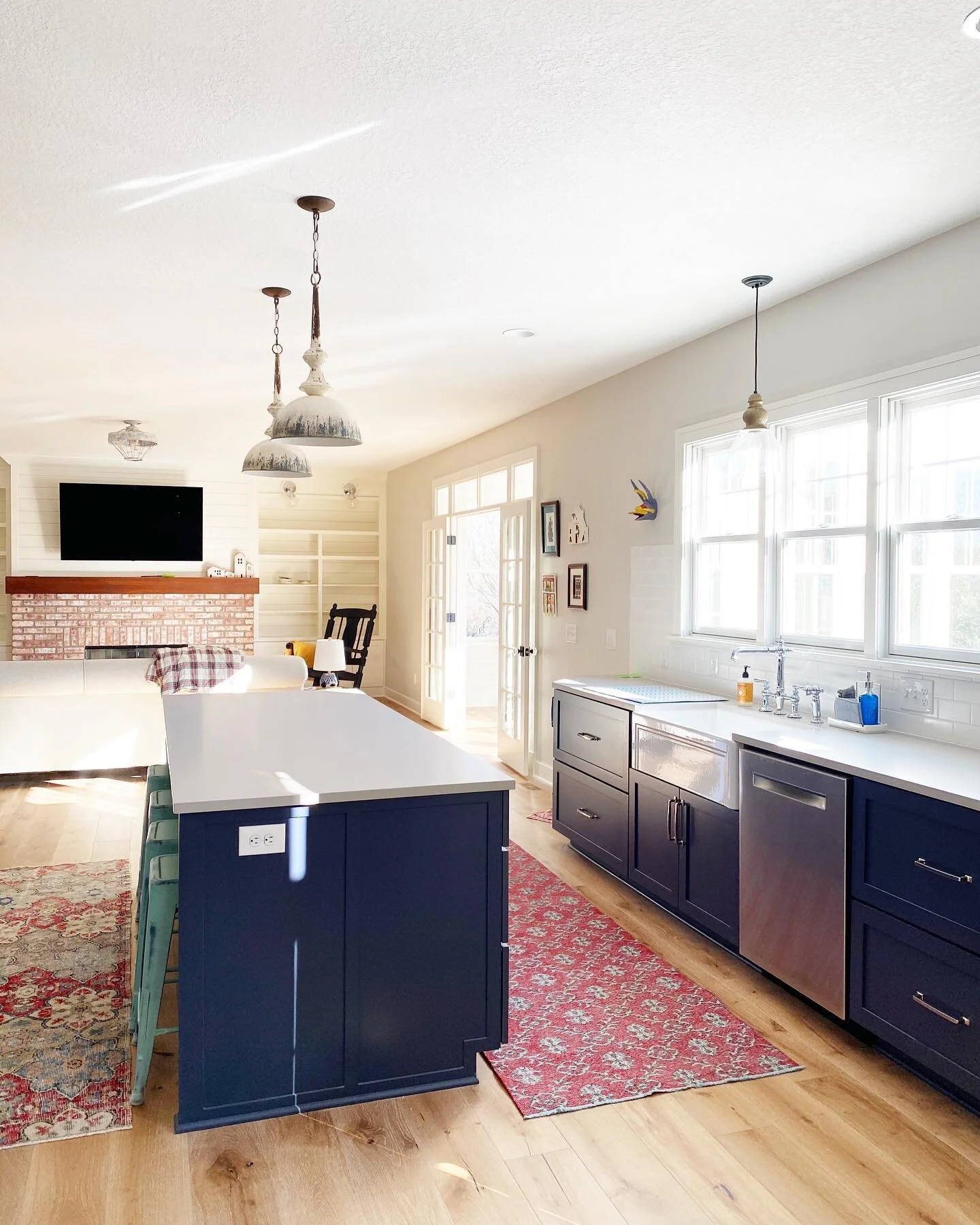
And THIS is the kitchen now. Well, kitchen AND dining room. By adding 10' to the width of the kitchen above, we got this - 18 glorious feet of kitchen, with enough room to eat in. Angels are weeping over its beauty as we speak.

get the look: pendants // cutting board // cabinet hardware // sink // faucet // mixer // towels // table
You guys know I basically have a phobia of upper cabinets and this kitchen was no exception. Why live on a lake if you can't see it!? We'd originally planned for the five windows on the sink wall and then just the full light door going out to the deck. But then during framing, it became clear that those two extra windows were CRITICAL! I just couldn't imagine standing in that house and losing even an inch of lake view if we didn't need to. So a couple extra windows got ordered and a wall got re-framed (sorry, Mark!) But seriously - views > storage, amiright???

get the look: pendants // table // sink // tea towels // cutting board // faucet // blue vase
This is basically bragging at this point - I mean - who gets 180 degree lake views!? It's obscene! This house sits up off of the lake, too, so it's like living in a treehouse surrounded by gorgeous, sparkling water. I may be a little jealous!

get the look: pendants // table // blue vase // cabinet hardware // cutting board
Because of the limited square footage at this home, it was important for us to keep things as flexible as possible. By utilizing a dining room table instead of a built in island, we kept the feeling of the home cozy, while allowing for multiple seating arrangements during large gatherings.

get the look: pendants // table // blue vase // sink // tea towels // cutting board // faucet
Here's a pretty good look at how open the kitchen is to the living room. I know at our house, everyone always ends up in the kitchen, but here it's nice to be able to have conversation flow between the rooms. It gives the home, which is just around 1300 SF on the main level, a real feeling of spaciousness.

Our clients chose to have us custom build and finish these tall cabinets in our shop. Because we replaced upper cabinets with windows, we needed to find more storage for them in the kitchen. These cabinets are beautiful AND functional, serving as a pantry and place to hide the microwave!

Taking the subway tile backsplash just to a standard 18" on the window wall allowed for a splash of this beautiful wall color to be displayed, while taking it to the ceiling on the stove wall gives the space a touch of cottage glam. Because the beam in the living room had to stay (it's structural), we decided to run with it and bring in some warm tones, too. This house is a great example of how you can really mix wood tones. The flooring keeps its tone well with the paint colors and decor, which allows for a warmer accent tone to be brought in. The custom made floating shelves are extra heavy duty. We stained them and the range hood both to match the living room beam.

get the look: metal basket // mixer // bottles // knife block
One more of the windows. I can't help it - they're so pretty! Fun fact: We ordered the windows to all open the same direction - so they can catch the breeze off the lake in the summer and cool the house.

get the look: sink // cabinet hardware // tea towels // cutting board // faucet
And now for something new... a video tour! I probably wanted to say the word incorporate a few more times... cringe! But here it is - it gives you a sense of how light and open the house really feels.
And there it is! We also used some of the addition space to gain a walk in closet and bathroom to create a master suite for our clients - which was a huge bonus!
{this post contains affiliate links}

Hey there! We're Mark & Angi. We're the owners of PCW design/build. Together we've worked on countless projects over the last 20 years and now we're ready to share a little (or a lot!) of what we've learned with all of you! More about us here...
SHOP FRESH FINDS


SHOP OUR FAVORITES


FOLLOW US ON INSTAGRAM


{This sidebar contains ads and affiliate links}